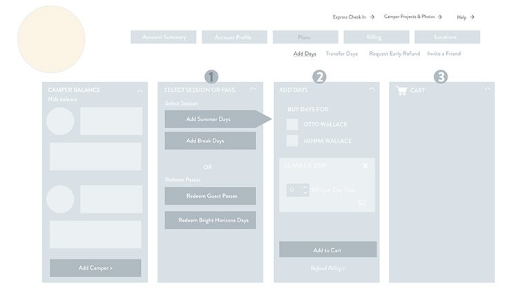
The Accounts & Registration Re-design exploration provided screens to help define and size two possible directions: a refresh of an existing flow versus and a complete re-design. It is a good example of how I provide assets to evaluate different design directions.
Scope:
Design Exploration Phases
My Role:
- UX design
- Visual design

Potential design direction for the Accounts page
Starting with the least amount of change
Steve & Kate’s had long been talking about redesigning their legacy registration and accounts system. However, there were a lot of questions about the size of the engineering effort and investment.
“When there are questions about the desire to invest in a given effort, it can be helpful to create phases that allow stakeholders to determine if they want to continue forward after each milestone.”
Phase I: Re-skin Screens & User Experience Evaluation
In order to evaluate possible design directions and help the team better estimate options, I began by creating screens for a refresh of the existing flows for adding Camp days and registering. This was a relatively quick design task because it wouldn’t change the established metaphors or order of operations. It would, however, give me the opportunity to talk to parents and staff using the cleaned-up user interface. This allowed me to complete the basic design task and further research the biggest sticking points in the existing flow.
I found, and our support requests validated, that parents were most confused during a few primary tasks:
Selecting a pricing plan when first signing up for Camp
Finding information relative to their specific preferred locations
Knowing when to purchase or add extra Camp days and completing that transaction (often as they were arriving to check in)

Initial re-skin, leaving existing flow in place

Users were still confused by pricing plans and location options that my not be relevant
Phase II: Exploring New Metaphors in sketches
After I presented the cleaned-up screens and findings to leadership, they felt the refresh might not do enough to improve the experience, but they were having trouble imagining how it might change and still felt concern about the engineering effort.
In order to give them a sense of the possibilities, I created some very loose wireframes to explore some updated metaphors including:
a clearer decision tree with contextual support for choosing a pricing plan
a more modern shopping cart experience
a zip-code based entry to registration that pre-populated preferred locations so we could provide location-specific information consistently throughout the experience

Sketch exploring new metaphors for account locations

Mobile sketches

Sketches exploring new cart metaphors for adding days
PHASE III: Creating Basic clickable Wireframes
After presenting the wires in Phase II, stakeholders were still interested in pursuing these ideas and so I continued by making rough, clickable wireframes to give a basic sense of the possible flow. At this stage, I worked mostly in mobile since I like to use a mobile-first approach for designing (and styling) UI.
A clip from the basic wire interactions

Basic set of clickable mobile wires
PHASE IV: Questions about look and feel
After seeing the wireframes, there were questions about how the visual design would be applied, so I took only a handful of screens to higher fidelity to demonstrate how the wires might change in look and feel if we decided to move forward.


Phase V: Usability Testing with Improved Wireframes
At this point, engineers were able to begin to give sophisticated estimates on the level of effort required for the different options, helping to inform stakeholders decisions and providing feedback on early versions of the design feasibility.
The next steps would have been updating the clickable wireframes to conduct usability tests, focusing on the key areas of interest for users: plan selection, getting information about preferred locations, and adding days.
It was at this point that the company was re-structured and acquired, so I wasn’t able to conduct any further tests, so I remain curious at how the project might have evolved. Still, I think it serves as a good visual for phased design exploration.