This case study highlights two projects I led during my time at Steve & Kate’s Summer Camp that exemplify a human-centered design and build process. It describes the ways I balanced competing needs, quickly made impact for users while building towards larger goals, and delivered two products, Springboard and The Pool, that solved real-world problems for kids, parents, and staff.
By human-centered, I mean designs that solve problems for people, often outside of the technical sphere. By process, I mean a set of repeatable research and design/build practices that uncover problems and solutions, even those not explicitly articulated.
Read the full case study below, or just check out a summary.

Product stat snapshots a couple years after launch
Photos: Kate
WHAT
OUtcomes (Spoiler alert)

SPRINGBOARD
iOS app
Springboard allowed campers to upload their digital creations to their very own Time Machine. In this way, they could share the songs, films, coding apps, and photography they made at Camp. After its launch, most days saw an upload count of about 50-60% of all verified attendances. Parents and kids viewed camper creations at a rate of roughly two times the number of uploads each day. Learn more about the making of Springboard in the case study that follows, or check out the project page for finished product images.

THE POOL
iOS and web application
The Pool became the digital platform for Camp. It gave campers access to view, share, and download their own (uploaded from Springboard) work. It also allowed them to view Steve & Kate’s project inspiration and how-to content for help getting started and unstuck with their projects. Before this product, self-directed learning in the studios relied on printed content alone. After its launch, campers viewed weekly Program Arc content with new skills (backpack making or animation tips, for example). We regularly saw skill video views at a rate of about 50% of all attendances and campers viewing their own creations at Camp at upwards of 90% of all attendances. Learn more about the making of the Pool in the case study that follows, or check out the project page for finished product images.
Why
Context
Steve & Kate’s Camp ran roughly 45 nationwide Summer Camps and 15 Spring Break & Holiday Camps with about 30,000 registered campers each year I was there. I came on as part of a new, albeit small, technology team in the Spring of 2016. Steve & Kate’s had decided to invest in in-house technology and we had the unique opportunity to design new products for an already profitable (primarily non-technical) business.
We served three primary user groups whose needs could be potentially impacted by our team:
Kids, or as they were known all summer, Campers
Parents
Camp Staff
Steve & Kate’s business wasn’t technology, it was caring for people. Our team was tasked with meeting organizational goals to support unobstructed learning in our Summer Studios (Film, Animation, Music, Fashion, Coding & Robotics) as well as operational goals for parent registration and daily Camp operations. Anything we built had to immediately impact these groups’ needs if it was to serve the business. It also had to be feasible with a small team. The seasonal nature of the business made Spring Break camps a very important prototyping and testing phase before Summer launches.

For context, any activity designed at Steve & Kate’s had serious competition
Photos: Kate

“At its heart, Steve & Kate’s business was caring for people. Our team was tasked with meeting organizational goals to support unobstructed learning in our Summer Studios as well as operational goals for parent registration and daily Camp operations.”
How
Research
As a technology team, we needed to identify the areas we believed could make impact and create products to do so. In order to understand the potential, I started my time with Steve & Kate’s with observations and collaborations. That included running workshops with leadership to clarify high-level objectives, visits to Spring Break Camps for observation of campers and staff, interviews with Camp staff and the people who supported them, and discussions with colleagues who had already begun to consider the challenges. Close partners during these early phases included the program designer and the departing product manager who were able to provide valuable insights and ideas about things they had already learned and tried.
I chose to capture data from much of my early qualitative research in a user journey map that highlighted:
touchpoints between the three primary user groups
artifacts shared by those groups
pain points and satisfaction points experienced by those groups
This format allowed me to truly understand the user experiences from parent registration all the way through to the way kids talked about (or didn’t talk about) their days at pick-up. It also allowed me to closely evaluate opportunities that would impact all three user groups simultaneously.
What’s more, I’ve found that if I start making stuff (with sticky notes and notecards and little drawings) that synthesizes what I’m learning and observing, I process it differently. During the making, I have ideas and see patterns I couldn’t have found if I just sat down to write a document or a pitch. Making unrefined stuff helps me share and elicit responses to a higher volume of ideas quickly so that I can make progressively more refined stuff. It is human nature to want to only present perfectly formed ideas and beautiful designs. I believe it is important to counter that impulse and share early work to learn more from other specialists while the cost of change is low.
“I started my time with Steve & Kate’s by listening and observing. I created visualizations to synthesize qualitative research. This allowed for design workshops and collaboration in early and low-fidelity phases of design exploration when the cost of change was still low.”

User Journey Map detailing Camp for three user groups from registration through pick-up with generated artifacts
We had some early insights:
Some of the best connections between campers, parents, and staff revolved around the creations campers brought home with them. From sewing projects to baked loaves of bread, these “take homes“ helped parents see what staff and campers had been up to all day. Campers were proud of their newfound skills and could demonstrate progress.
We didn’t have any way to quantify or share so many of the great moments and progress that took place during the Camp day. Digital creations (movies, songs, coding apps) weren’t making it home at all.
Camper creativity and learning were limited by the difficulty accessing and sharing work, especially over the course of a Camp week. Better feedback loops would provide more self-directed learning opportunities.
We were beginning to understand our targeted problem space. At that point, I created comic book versions of the user journey to share with nationwide staff and leadership in our yearly kick-off. The more accessible format allowed me to get additional feedback and understand which observations resonated most. It also allowed staff to see how we were interpreting what they were telling us and which problems we felt technology may be well-suited to address. Visualizations like this lead to more meaningful conversations because people (experts in their fields) have something to react to. They’ll tell me more about how my assumptions do or do not fit their experiences when responding to concrete examples.
“Through our research, we saw that digital take-homes could be an initial key to unlocking more connections between parents, campers, and staff. We had identified a larger problem space, but we knew any solution would include better access to camper creations.”


Planning, Scoping, and Definition
Being a small team, we knew that in most cases, we weren’t going to try to recreate creative apps we were already using at Camp. Instead, we’d facilitate campers’ ability to upload film creations from iMovie, animations from Stop Motion Studio, coded web apps from our in-house Coding Workshop, and music created with Garage Band or our singing app. In this first experimental phase, we’d support uploads from two apps to camper accounts, allowing them to share their digital creations with their parents. We’d utilize the share sheet activity view on apple devices to integrate consistently across the apps and create a very simple initial version.

Workshop designed to evaluate early design possibilities

An early, bare bones version of the uploader used to learn more about our assumptions and updated with features we added as we adapted to Camp networks

A parent email design with a new project upload alert
“Scoping an initial, lean project deliverable would allow us to test the upload idea in the Camp setting. This would give us our first insights into how many campers were truly interested in uploading their projects and how many parents were interested in viewing those uploads. As development work continued, we could further explore and plan for additional phases with the benefit of that early learning.”
Our very lean uploader demonstrated that the desire to share and view work was indeed there. Providing technical support for our first season with uploads from all of our apps also taught us a lot about infrastructural challenges that we had underestimated. We set up temporary sites in schools around the nation each summer, and had been relying on existing networks for our needs. It became clear that although they had previously been adequate, those networks were not all equally well-suited for the increasing demands sending movie and music files would require. Troubleshooting camper upload issues in that environment could be taxing for staff. This was incredibly valuable information. It helped us to add very pragmatic features to the first version of the uploader, including reporting on connectivity, the ability for staff to easily display and share device information and other versioning data we needed when providing technical support. In some cases, we also invested in additional networking solutions on site. We were already using badges wit QR codes for sign-in at Camp, but we learned that some badge covers with glare could be tricky for campers to use, so we made adjustments. The simplicity of the experiment allowed us to respond quickly to staff, building trust that we weren’t going to abandon them with complex solutions that didn’t fit their on-the-ground needs. In this way, we learned more about Camp directors’ need to collect e-mails and share camper animations during pre-registration pop-up events.
“This early release not only gave us confidence that further investing in the uploader was a worthwhile endeavor, it helped us see additional possibilities, add previously unimagined features, and build trust with our staff.”
After the departure of our product manager, I knew we wanted to continue to expand on the original “camper cloud” vision we had been developing. The excitement around file sharing had demonstrated that it was valuable to all our user groups… but, it also fell short for campers. They didn’t only want to access their creations to share with their parents, they wanted to be able to show friends, share them at the Camp-wide show-and-tell we called Showcase, continue work started on previous days and different iPads, and continue to improve their projects. In order to support self-directed learning, they needed access to their own work. We needed to take the idea much farther.
At the same time I was working on designs to create a platform that could support project sharing in our Summer environment, our program designer was dreaming of providing how-to videos to campers. She wanted them to have access to sewing skills and inspiration they might not otherwise see. She’d also done some prototyping as experimentation and had seen promise in her early tests.
“Though my work with our program designer, I realized that our “camper hub” could be a home base for not only project sharing, but also inspiration for project creation. This kicked off the next round of design and thus subsequent phase of our project. As a result, I was able to present our leadership with a more enriched platform strategy as well as build organizational buy-in for a solution that could grow with us. ”

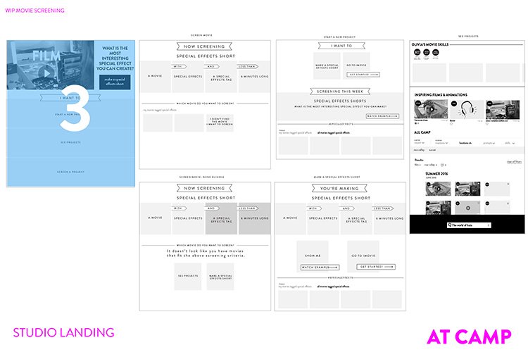
Defining the larger problem space

Low fidelity sketches for idea generation


Sample of prioritized rough wireframes


Product and Development Cycle
Steve (yes, of Steve & Kate) named our new platform “The Pool” and I began moving from conceptual and rough wireframes to full-color wireframes. We decided the next version of our uploader would be branded “Springboard“ and I worked to create a more full-fledged design consistent with The Pool as well as add features staff had requested for the Pre-Season.
I was acting product manager, so I valued our program designer’s distance, feedback, and art direction in this phase of design. For example, I like using a mobile-first design approach when working with responsive designs. At Steve and Kate’s, she suggested what I would refer to as a pre-reader-first approach. Designing with the assumption that the user may not read often made more efficient and usable designs for readers as well as parents and staff. For example, we used a Time Machine narrative and visual story to help younger kids understand their project timeline. Our program designer contributed illustrations and the metaphor quickly caught on with older kids as well as parents and staff, making a more quickly legible interface for everyone.
“As we furthered designs and moved through feedback cycles, I continued working with our engineering lead to define discrete deliverables that would allow for continuous integration and iterative work cycles. I led weekly iteration meetings and contributed CSS to our codebase. ”
While we worked to keep things simple, we tried to build with an eye towards the future. For example, when establishing the minimum viable product, we considered only providing how-to content for the Fashion studio. However, knowing that building for two Studios would help us abstract the platform to support different kinds of how-tos and content from the start, thus making the product more flexible, I decided to add Robotics. This helped create clear acceptance criteria and goals for engineers and content creators. We even found that once we figured out a pattern for the first two Studios, we were able to add more and deliver more than we had expected.
Similarly, as I developed visual elements, I looked for opportunities to re-use components and standardize approaches. This meant that parents and campers might see an almost identical project listing page or that staff badges would reveal an extra component in an otherwise identical view.
“Working closely with our head of operations and program designer, I also began planning how our digital creations would operate in the (very demanding) physical environment that only 40 some summer camps of 200 plus kids each can provide. Content creation and management, project moderation, device allocation, physical location and presentation of the devices, staff training, and network strength would all play a role in the success of the vision.”

Uploading from Springboard


Design for logged in project screen from Animation Studio

Viewing projects at a kiosk

The Pool’s inspirational content in action at Camp
Photo: Kate
Launch & Iterative Refinements
Our first summer with the Pool saw a lot of use and gave us the opportunity to refine our content and my designs with the benefit of daily users. We experimented with the locations of our kiosks, released new content, showed promo videos during the Camp-wide Showcase, visited sites and watched metrics to see what worked best.
Hilariously, in one experiment where we spray painted our cardboard iPad kiosk, we saw usage increase significantly, leading us to print our cardboard cases in color the following year. Additionally, we learned that we could inspire fun cross-studio collaboration when we coordinated our inspirational content with the program designer’s weekly Camp themes, so I incorporated designs for weekly featured content, or the Program Arc, and we updated our content management system as we found what worked best for engagement and ultimately, studio activity.
“Interestingly, because one of the goals was for campers to move from inspiration to action, it was challenging to measure when we had succeeded. In some ways, we had to depend on anecdotal data from staff who would suddenly see a jump in a certain kind of sewing project or robot construction. Some of the metrics for video views showed a drop-off after a certain number of the early videos in a series and then re-engagement around the end of the series. At first we were confused as to what was going on, but observation suggested kids were starting a project series, getting excited and jumping into action, and then coming back in smaller numbers to see the final, trickier steps of a how-to. In the end, along with seeing how excited campers were to show off their creations, these were the metrics that made me the most proud of our work.”